Dimensionality reduction for visualization purposes in the SPEAR V-IDS
10/13/2020
Dimensionality reduction (DR) is a procedure that transforms high-dimensional data into a lower dimensional representation, usually involving the minimum number of features required to adequately describe the key properties of the data. It is mainly used with different types of real-world data (such as time-series, images, medical records, unstructured text, etc.) and enables processes of visualization, classification, compression and others.
One of the main benefits of applying dimensionality reduction to a dataset is that it helps in visualizing the data. Offering a comprehensive visualization of data in higher dimensions is not an easy task, so reducing the space to 2 or 3 dimensions allows to plot and observe patterns more clearly. For instance, in cybersecurity applications an Intrusion Detection System (IDS) is used to monitor network traffic and operational data over time, and as a result, hundreds of parameters are captured at each time instantly and need to be observed by the system operator. DR assists in providing a simple 2D or 3D visualization of all the obtained parameters forming patterns that can be easily interpreted by the system operator without significant knowledge requirements on data analytics. The SPEAR V-IDS incorporates DR techniques that provide the required visualization capabilities and allows the end user to discern otherwise undetectable security issues through the formed patterns.
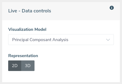
 Inside the V-IDS dashboard, the visual statistics tab offers an overview of the network condition by providing a comprehensive set of visualization methods for the operational data, based on dimensionality reduction. Through the different graphs provided, the operator is able to observe the live status of the network traffic and detect potential anomalies by interpreting the visual patterns. The system also allows the user to observe the status of the network at previous dates utilizing the historical data stored in the V-IDS database. This functionality enables the operator to have a simultaneous overview of the live and historical status, allowing a straightforward comparison between them. The live diagrams are updated every minute according to the incoming operational data. The user can choose between 5 different visualization models and select the representation in either 2 or 3 dimensions. The analytics are executed once the representation has been selected.
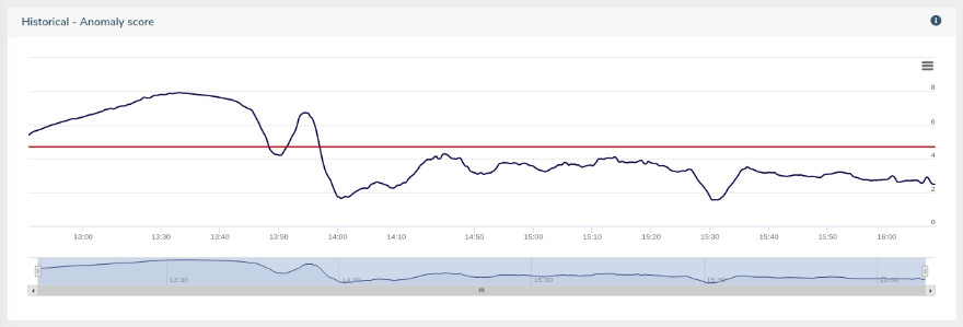
The first diagram presented is a line-chart displaying the anomaly score of the operational data over time. The red horizontal line represents the threshold of normal values, calculated as the statistical centre of the normal data. The black line represents the distance from this threshold, indicating how close to normal the incoming traffic is at each time instant. There are 2 such diagrams offered, one for the live operational data and one for historical data stored in the VIDS database. In the latter, the user can select a time window (i.e. 3 hours) and scroll through the diagram, observing the anomaly score over that window throughout the day.

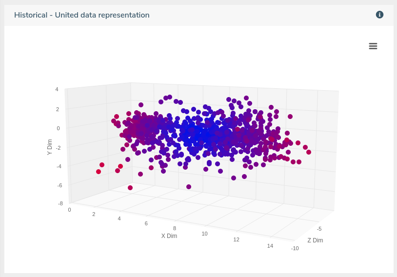
 The graphs presented next are scatter plots depicting the reduced dimensionality space of the operational data. Here the user can choose between a representation in either 2 or 3 dimensions, with the options offered again for both live and historical data. At each time instant, the live scatter plot displays the current status of the network, after executing the visual statistics algorithms using the most recent operational data. In the case of the historical data, the scatter plot represents the status of the grid throughout the whole selected date. The visual patterns formed in these diagrams allow the operator to observe the network’s status and determine anomalies by looking at the position and tint of the projected points. As demonstrated in the example figure above, potential anomalies are showcased by grouped points having a red tint.
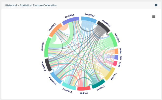
 The final visualization is offered in the form of a dependency wheel diagram, which displays the correlation between the recorded features of the operational data. A higher line width indicates a stronger influence between the corresponding features. The user can hover at each line and observe the actual value of the connection. Values close to “0.05” indicate no correlation, while values close to “1” recommend strong relation. As with the case of the scatter plot, the live dependency diagram shows the status corresponding to the most recent operational data at each time instant. The historical diagram displays the average value throughout the selected date for each connection, as calculated in the VIDS backend services.